TENNISGO
As an avid tennis player who has worked in a tennis center, booking courts for players alike, TENNISGO was created to aid in the process of finding a local court, booking said court, and seeing live availability.
Contributions
UX Designer
User Research
Prototyping
Usability Study
Project Type
Case Study
Desktop Application
Background
Problem
The problem the app aims to solve is the difficulty and inconvenience of finding and booking tennis courts, particularly for users who are new to the area or who have limited knowledge about local courts.
Solution
The goal was to create a user-friendly platform that simplifies court booking, delivering comprehensive and reliable information to elevate user satisfaction within the tennis community.
User Research & Personas
Objectives
To understand the needs and frustrations of users when it comes to finding and booking tennis courts, we conducted a series of user interviews and surveys. We also conducted a usability study to test the app's design and functionality.
Pain Points
- Difficulty finding available courts that meet their needs and preferences.
- Complex and time-consuming booking process.
Persona

Sam Lee
About
Age: 24
Gender: Male
Job: Recent Graduate
Environment
Tennis level: Beginner
Sam needs a convenient and affordable way to find and book tennis courts that are suitable for his skill level and budget.
Pain Points
Found that there were too many steps for a simple function like creating an account or navigating through menus.
Spent too much time searching through mutliple sites and applications to find a court.
Goals
Sam needs this because the current options for finding and booking courts are either too expensive or too difficult to use, which makes it difficult for him to get started with the sport.
Affinity Diagram
Insights
- Difficulty finding available courts that meet their needs and preferences
- One of the major pain points identified through user research was the difficulty users had in finding available courts that met their needs and preferences. Many users reported that they had to spend a lot of time searching through multiple websites and apps to find a court that was suitable and available at the desired time.
- Complex and time-consuming booking process
- Another pain point identified was the complex and time-consuming process of booking a court. Users reported that the process was often confusing and required multiple steps, such as creating an account, entering personal information, and navigating through different menus and options.
Usability Testing
User Frustrations
"I am unsure of the availability of public courts in my area."
There really is no application I use to find courts, I only use my maps app."
"Tennis centers are the only places that have semi accurate availability times."
User Needs
"I want to able to book courts with ease."
"I would like to see the availability of nearby courts."
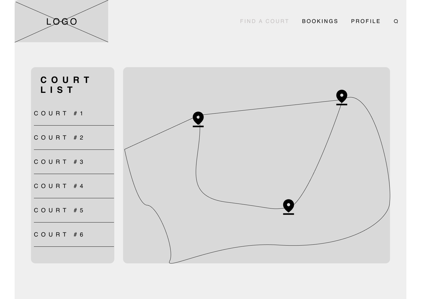
"I want to see a map of courts in the area."
Features Desired
"It'd be nice to have a rating system, to see which courts are the best in the area."
"I believe a live availability system would be useful."
2/10
users mentioned that there was no sub menu for the proile section, wanting to go to each sub menu.
3/10
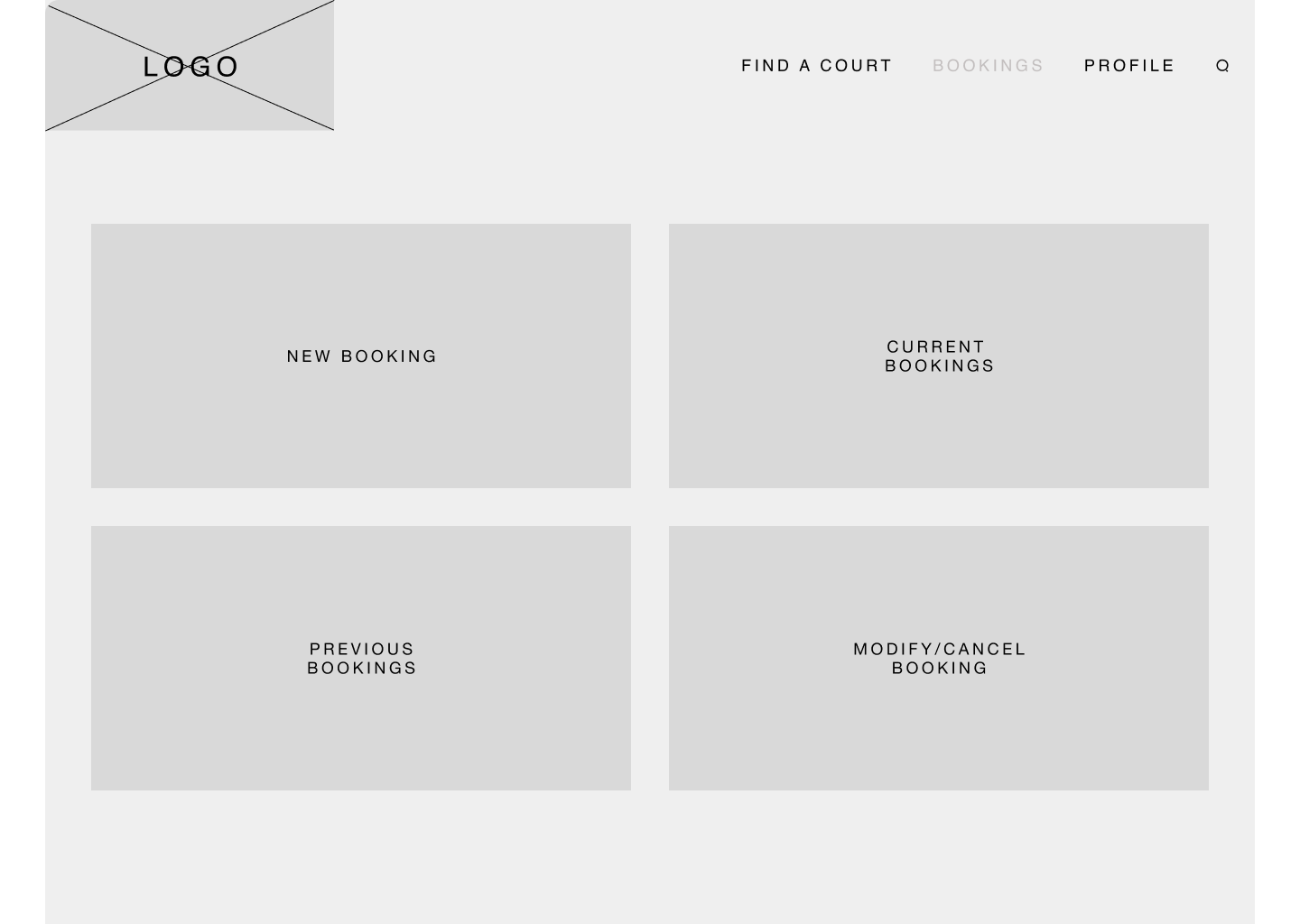
users thoughts that the booking panels were a bit too repetitive, making it hard to discern which page they were on.
5/10
users had similar feelings about the general aesthetic of the booking page as it was TOO simple.
Conclusion
Components are a lifesaver
This was the first time I implemented a design system for myself to guide my design choices and keep everything uniform.
Iterate, iterate, iterate
Even in the lo-fi prototypes, iterating is something I wanted to focus on in this project to really see the impact revisions really had on user interactions.
Adaptability for future designs
In order to create a successful application, the main thing that I keep in mind is, "How can this be applied to as many people as possible and how can I expand this for future iterations?" I see now that this application can be applied to not just local courts, but to established city facilities that can adapt it into their existing program.

