PNC Banking Redesign
As an active user of PNC banking services, I embarked on the redesign of their desktop and mobile applications to enhance user satisfaction and address existing challenges. Through meticulous research and thoughtful design decisions, this project aimed to create a seamless, user-friendly experience that aligns with modern expectations.
Contributions
UX Designer
User Research
Prototyping
Usability Study
Project Type
Case Study
Desktop & Mobile Application
Background
Problem
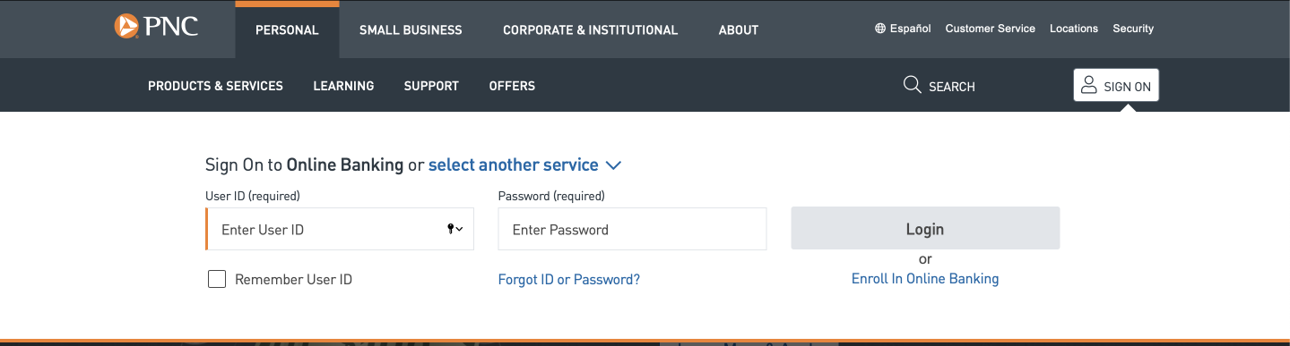
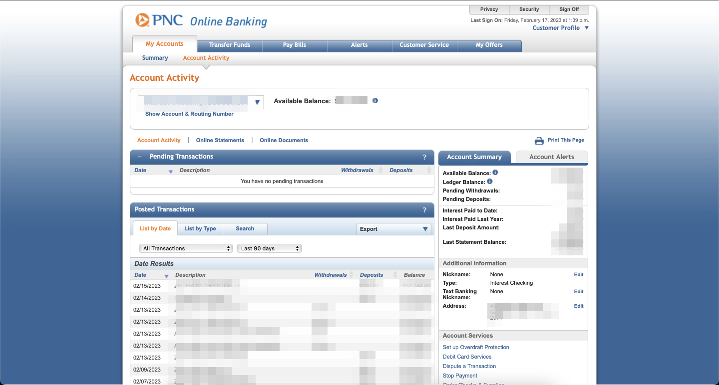
A key challenge in the current PNC banking applications is the lack of consistency in user interface elements between the desktop and mobile versions. Users encounter confusion due to divergent visual styles and feature placements when transitioning between platforms. Resolving these inconsistencies is vital for creating a seamless and intuitive experience across all devices.
Solution
Introducing a unified design system will ensure a consistent visual identity, harmonizing elements across desktop and mobile applications. Simplifying navigation with standardized layouts aims to reduce confusion, providing users with a seamless experience across devices.
User Research & Personas
Objectives
Understand user interactions, identity pain points and evaluate the effectiveness of the design changes.
Persona

Alex Turner
About
Age: 32
Gender: Male
Job: Marketing Manager
Environment
Marketing Manager
Tech Proficiency: Moderate
Banking Habits: Regularly uses both desktop and mobile applications for daily transactions and financial management.
Pain Points
Confused by inconsistent user interfaces between desktop and mobile applications.
Gets lost in complex navigation bar on desktop.
Goals
Easily navigate through the homepage navigation.
Have familiar interactions between both mobile and desktop applications.
Prototyping
Initial Sketches
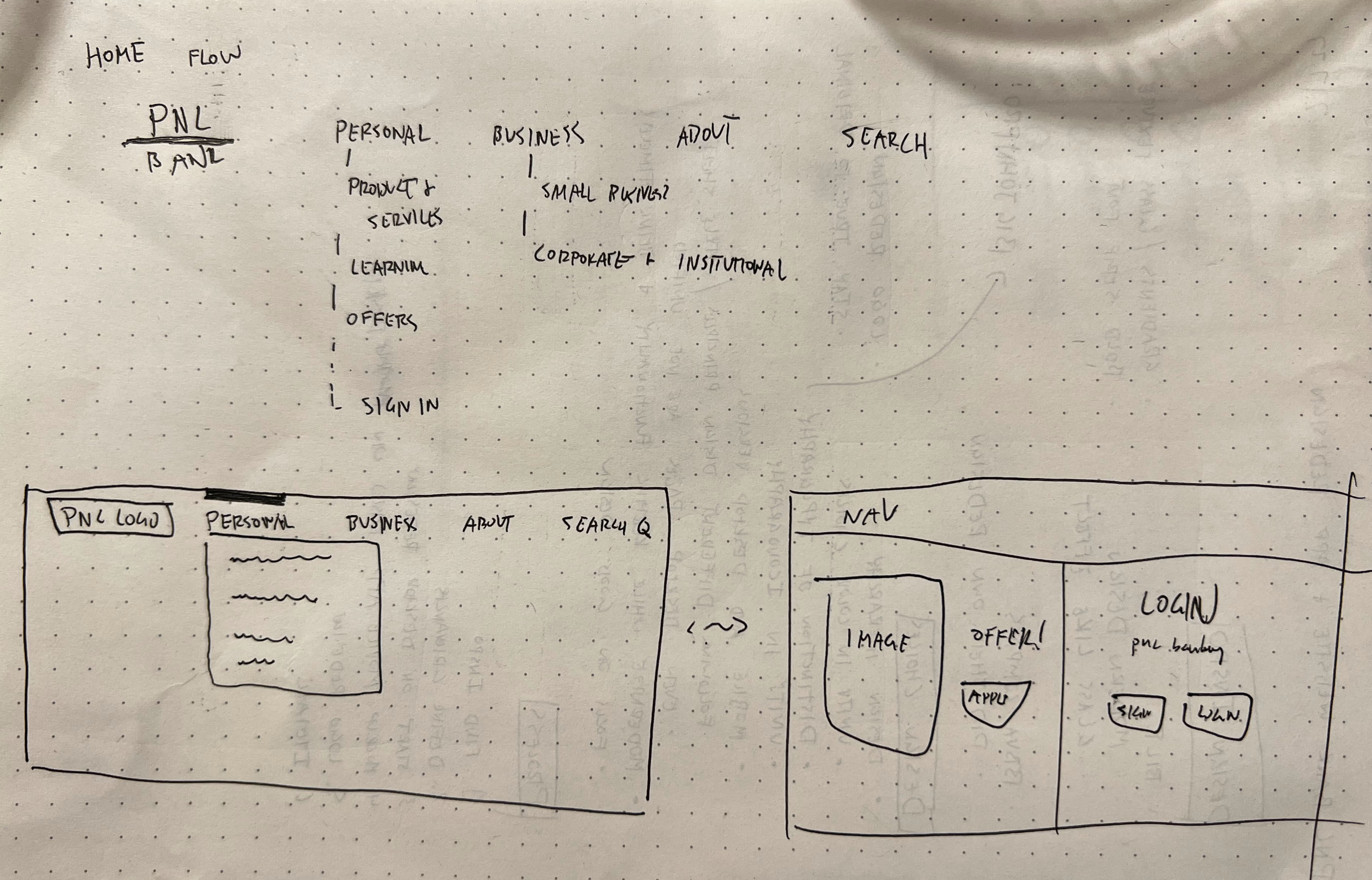
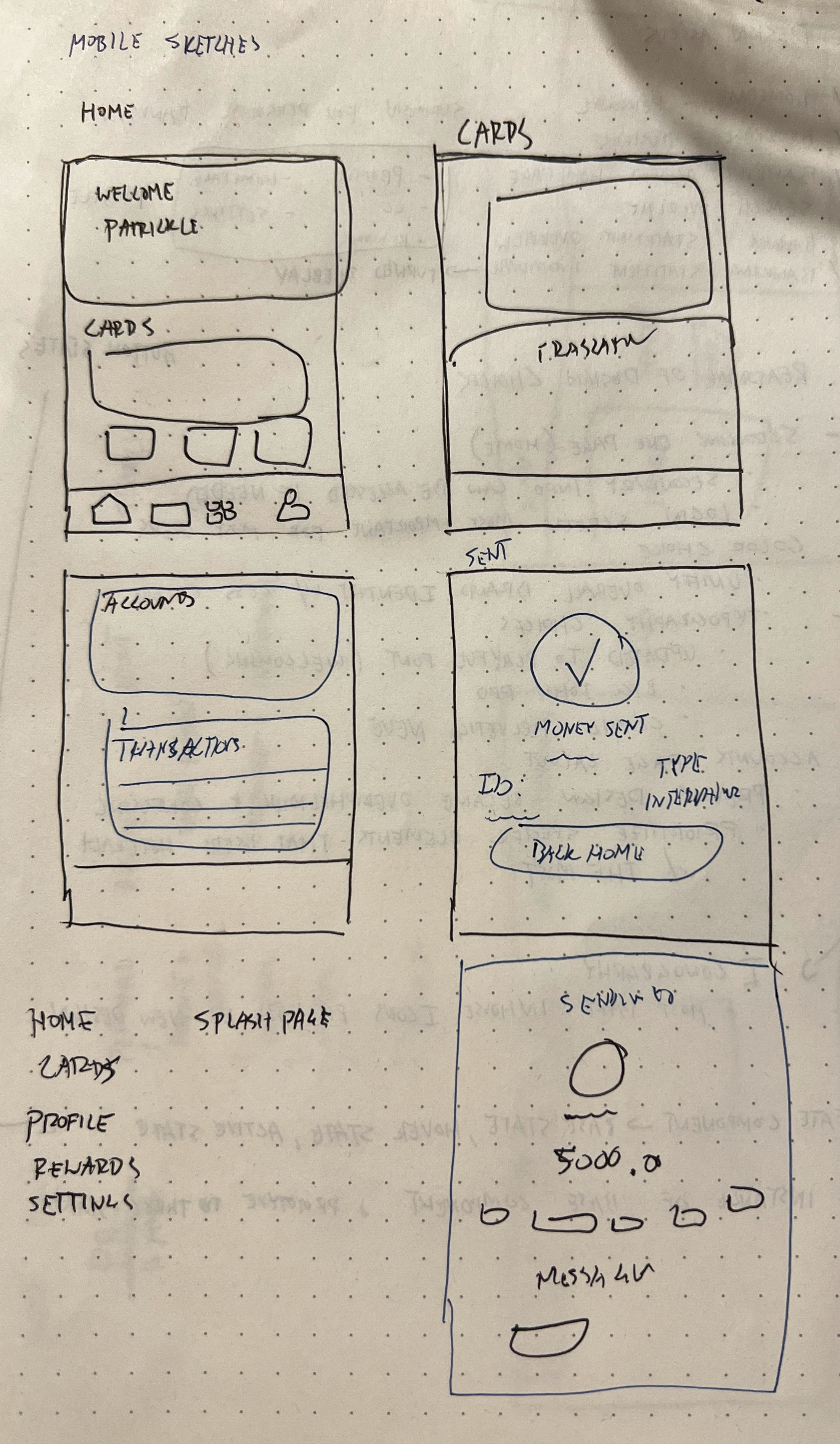
These sketches provided first impressions on the general structure of the main landing page and navigation bar.
Current Design
Usability Testing
User Frustrations
"I am unable to track notifications."
"There is too much information on one screen."
"I do not like how the website looks different than the mobile app."
User Needs
"I would like to view my banking account information easier."
"I want to see previous notifications."
"I want to have a unified homescreen."
"I would like to have easy access to my profile preferences."
Features Desired
Confused by inconsistent user interfaces between desktop and mobile applications.
Gets lost in complex navigation bar on desktop.
8/10
users mentioned that there was too much information to consume.
10/10
all users became frustrated with the mobile application on how they were unable to access basic functions.
2/10
users did not mind the general look and feel of the website's colors and layout.
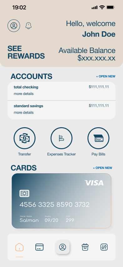
Final Designs
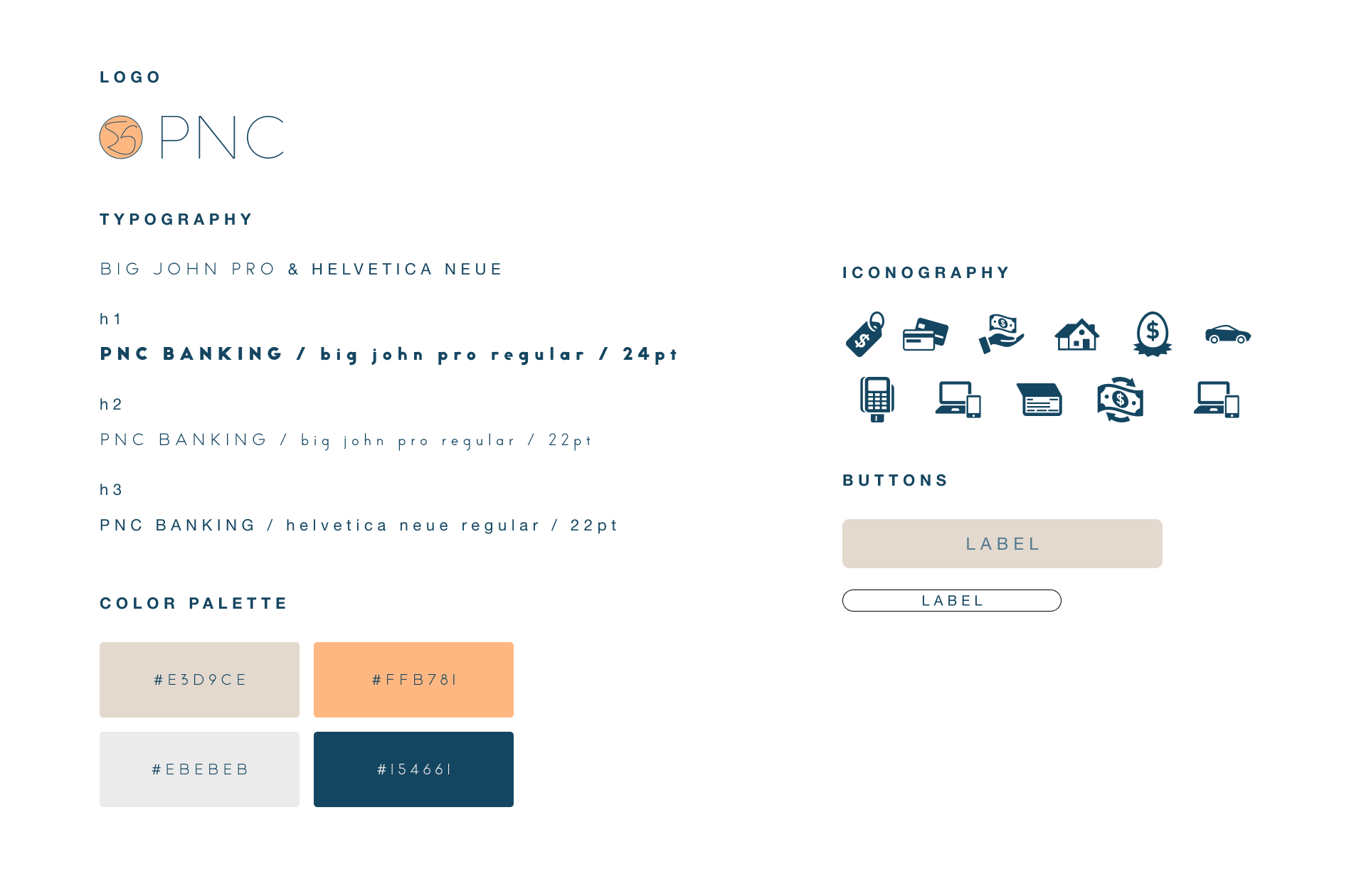
Style Sheet
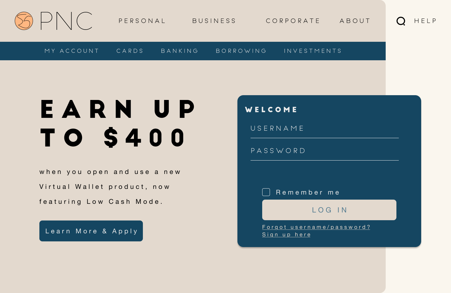
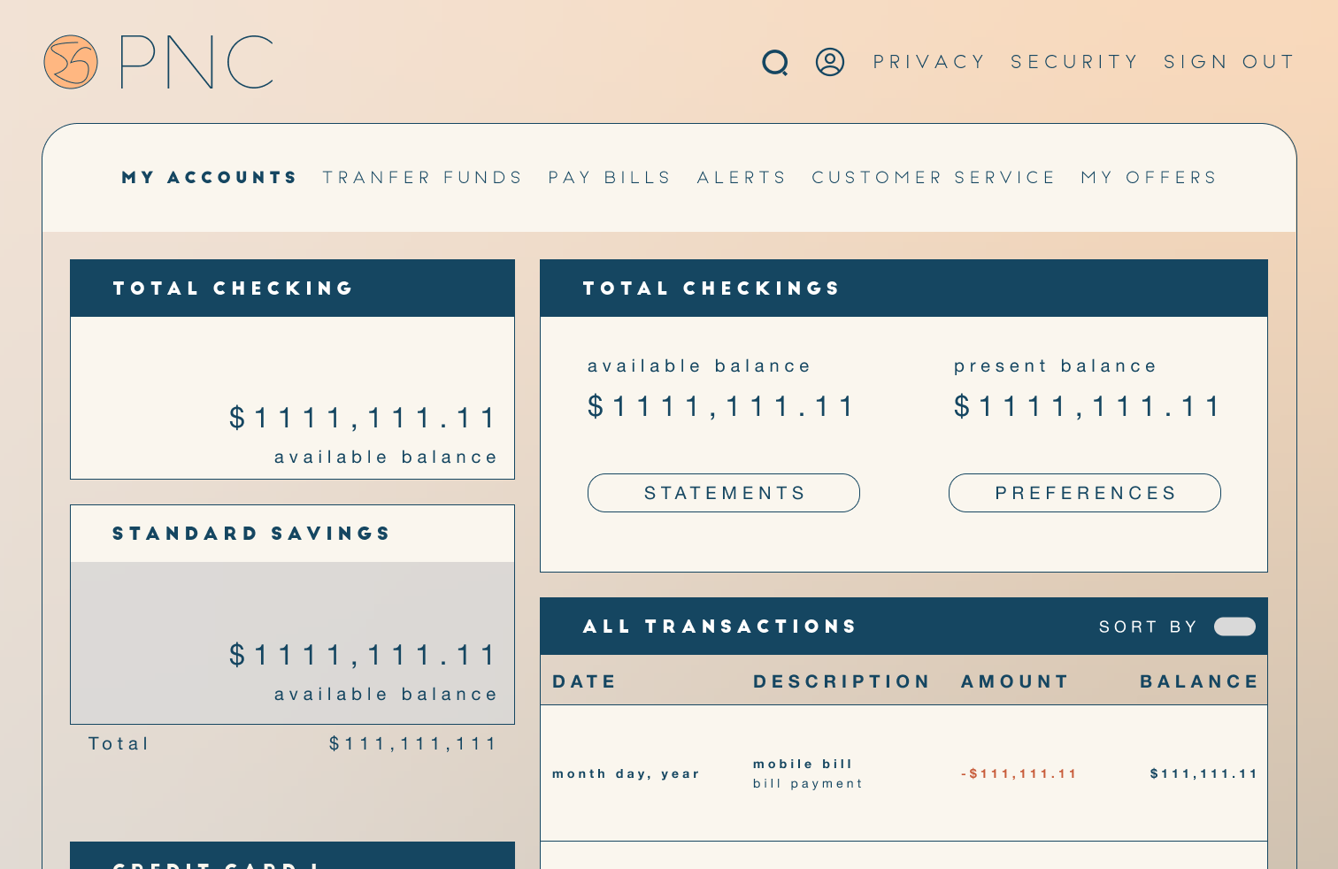
Desktop Screens
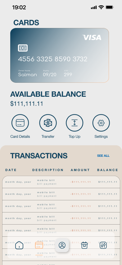
Mobile Screens

Conclusion
User Satisfaction is Multifaceted
This underlines the importance of considering not only task completion metrics but also the user's perception of the experience. Gathering qualitative feedback provides valuable insights into user sentiments.
Consistency is Crucial
mplementing and maintaining a cohesive design across different devices is essential to avoid user confusion and enhance overall usability.
Navigation Complexity
Simplifying navigation structures and ensuring a straightforward process for common transactions is essential for user satisfaction.